French Postcards
Philpott, Chris
Chris Philpott
(Based on 1 review)

"A brilliant Out of this World experience! When Chris did this for me I had one of those "*^%$@ why didn't I think of that?" moments. Presentational gold!" -Steve Valentine
A study out of Cornell University recently made headlines: subjects could predict if a picture was going to appear on the left or right side of a computer screen but only when they used erotic pictures!
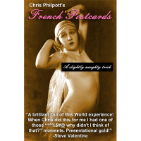
To test the theory, you show 12 postcards from various destinations and 12 French postcards (these are vintage nudes -- elegant, sepia-toned, upper-body nudity). The cards are mixed; then, without looking, a spectator sorts them by sensing if a card has sexual energy or not. The results are perfect!
The effect includes 24 custom-made postcards, written instructions and links to video instructions, updates, extra effects and a bonus comedy script by professional comic and magician, Bruce Gold. Also includes Jon Armstrong's "Out of this Blah Blah Blah," the cleanest OOTW handling ever!
"Finally, a reason to do Out of this World, that holds attention from start to finish. With French Postcards, they'll never forget you!"
-Steve Valentine
French Postcards Key Selling Points:
Paul Curry's Out of this World (released in 1942) is justly revered as one of the greatest of all card tricks. The plot is clear and seems utterly impossible: a spectator uses intuition to separate the red cards from the black cards. It's powerful, empowering and easy-to-do...
And yet, it is far from a perfect trick. What exactly does the audience see in performance? They see someone sort 52 pieces of paper into two piles. That's not magic, it's filing!
While there have been hundreds of methodological variations on OOTW, most don't address the core problem of making it entertaining: how do you add emotional stakes to someone dealing out cards, trying to separate red from black?
By moving from playing cards, French Postcards accomplishes several important things:
- More entertaining. In "French Postcards", the volunteer is not sensing if the card is red or black - he or she is sensing if it feels sexy or not. Instantly, this becomes more interesting, engaging and funnier. You don't have to tell a single joke - the situation itself is funny (but if you want to tell jokes, the script by Bruce Gold is excellent).
- More real. Because the premise is based on a real study, it makes the effect more believable and relevant - this is an effect that can make spectator's cry as well as laugh (you can see both in the trailer).
- Better visibility: the postcards are larger and can be seen better by your audience. The two types of cards are oriented two different ways (vertically and horizontally) and veer toward two different color-palettes (reddish versus blue-ish) to further increase visibility. The cards are visually more interesting than playing cards.
- More fooling. The size of the postcards seems to preclude sleight of hand, cutting off one possible explanation for how the trick is done.
And yet with all these advantages, French Postcards is no more difficult than the original effect.
Reviews
(Top ▲)
This is a wonderful update to the classic Paul Curry plot, Out of This World (OOTW).
Chris has come up with a unique twist that uses a collegiate lab test that was actually done at a rather renown university as the background for the effect. This was very good thinking!
As far as the method goes, the one as outlined in the included instruction booklet is nothing new; in fact, it is rather standard. The difference here is that you are using images rather than playing cards and in fact, they are a bit larger - they are actual postcard size. There is nothing outwardly special about any of the postcards, but there is a very useful tool hidden on the backs of all of them, and even that is not necessary to use.
If you are the type of person that does not like seeing images with nudity, tasteful or otherwise, this product may not be for you. If you perform only in venues and only for audiences where nudity of any sort is not appropriate, this product may not be for you. Having said that...
The nudity is very tasteful and these are old images from around the 1920s or so. The nude postcards (called the French cards) have a nice sepia tone. Also among the 11 female partial nudes is a male nude (we will call it the fig leaf nude), making for a total of 12 nude or 'French' cards.
The other twelve post cards are in full color and they are images of very well-known holiday/tourist destinations around the world, including places like the Golden Gate Bridge in San Francisco, CA in the US to Eiffel Tower in Paris, France. These are also very nicely printed.
I had a hard time believing that the postcards were custom printed because they look so normal and genuine. In fact, for the most part, they are. In fact if you really wanted to, you could use them for exactly that because on the backs of all 24 postcards there is a place for a stamp, lines for the address and the blank space to write your message in. As I said earlier, there is a useful feature on the backs of all the cards that looks absolutely inconspicuous - nobody will ever see it.
The instructions are in the form of a small printed booklet and include a bonus handling in addition to the regular version that Chris uses. He also teaches you how to do a very simple and by now classic shuffle that may well already be in the toolbox of practiced card workers. Also in the instructions is a password which you are told to e-mail to Chris, after which he will send you the extra files, including video instructions and any future updates related to this product. I have not had the chance to check these out just yet, but I will post an update to this review discussing them later.
The instructions are very clear and to be honest, if you already know how to do the classic Curry handling (or even the U.F. Grant version) of OOTW, you already know how this works. You are not buying a new handling for OOTW but you are buying a new and very unique presentation for it. Personally, I have been getting very good reactions with this and even though these are not playing cards, if you put a little thought into it, you can come up with other ideas to tie into the images on the postcards.
Also included in the instructions are some extra suggestions for optional scripting, some of which is heavy innuendo. It would be very funny with the right crowd in the right venues, but you have to use your judgment on that.
It is not mentioned anywhere in the instructions as to whether you should or should not fill in the address and message areas on all of the cards and maybe even go as far as having a cancelled stamp on every card. Personally I think it would lend just that one extra degree (thank you, John Guastaferro) to elevate the reality of the objects. Not that they need it - it was just a neat idea I had.
The ad copy for this product is 100% accurate as they have been for all of the other products that I have seen from Chris. He does not claim anything new, he just claims the unique twist and its key points, which it absolutely deserves.
As I said before, this product, even though the nudity is very tasteful it is nudity nonetheless, may not be for everyone. If you find yourself desiring or needing a fresh presentation for OOTW that has a few more possibilities for premise and presentation, this will fit the bill nicely. If you are one of those performers...
I very highly recommend this product!


